Very Identity
Client: Very
Year: 2016
Role: Art Director, Designer
Team: Creative Director Stefan Kjartansson, Strategist Kenny Ferguson, Typographer Michael Cina
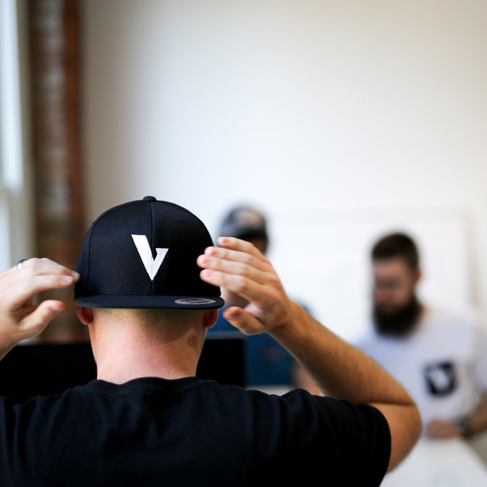
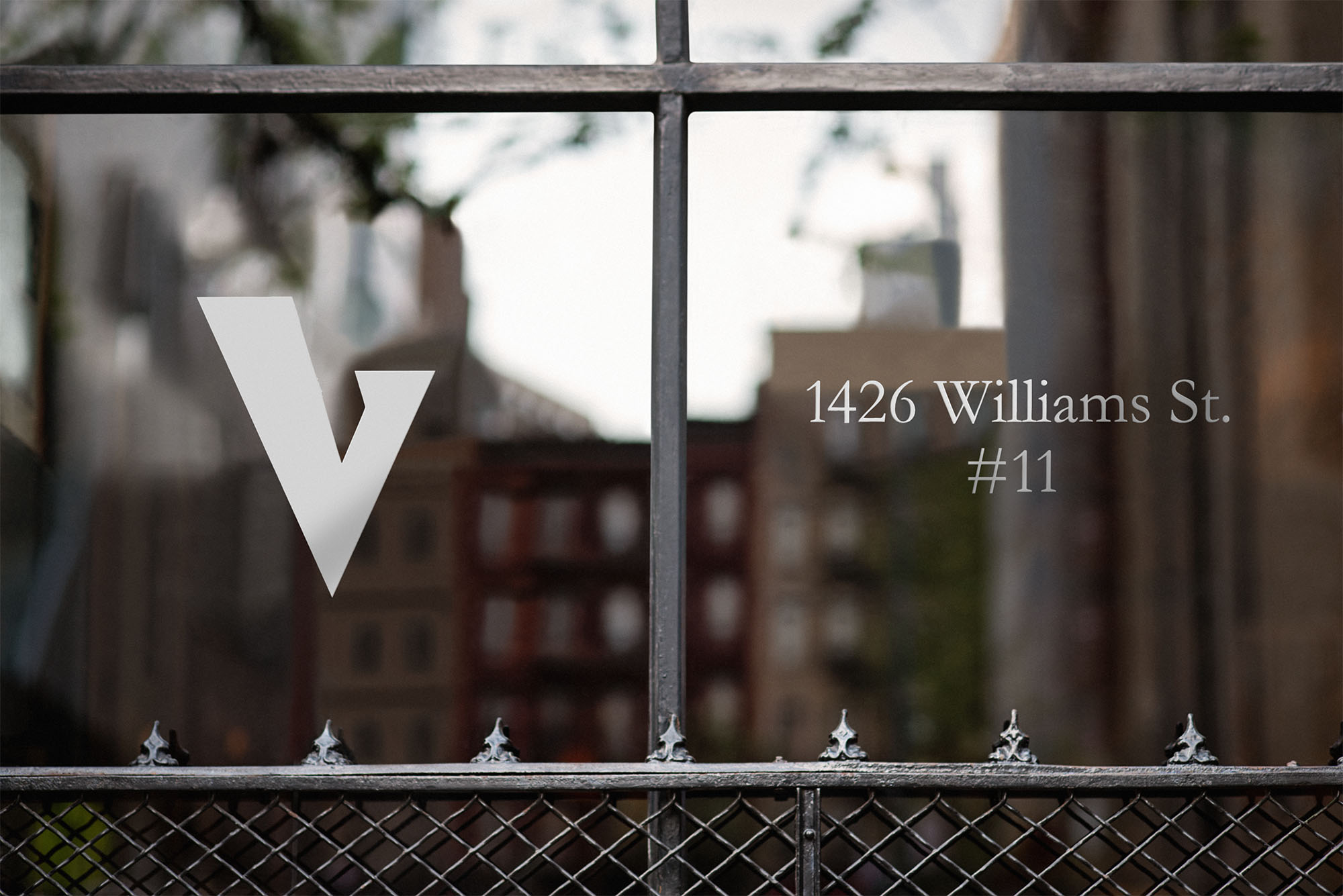
Logo and visual identity system for Very, a Chattanooga-based technology company that had outgrown its roots as ‘Spartan.’ Poised to expand their team and client-base, the company sought a new name and mark to position themselves in a friendlier light.
Through extensive research, exercises, and exploration, our team narrowed in on the name Very—embodying the exceptional modifier the company aspired to be to their collaborators. From there, we designed and engineered the heavy serif wordmark, looking to differentiate the brand from the multitude of san-serif logos in the technology space.
With the initial lettering complete, we handed off the design to expert typographer Michael Cina to build out the remaining characters into a full-fledged typeface, empowering the Very team to communicate their brand in any application.
Year: 2016
Role: Art Director, Designer
Team: Creative Director Stefan Kjartansson, Strategist Kenny Ferguson, Typographer Michael Cina
Logo and visual identity system for Very, a Chattanooga-based technology company that had outgrown its roots as ‘Spartan.’ Poised to expand their team and client-base, the company sought a new name and mark to position themselves in a friendlier light.
Through extensive research, exercises, and exploration, our team narrowed in on the name Very—embodying the exceptional modifier the company aspired to be to their collaborators. From there, we designed and engineered the heavy serif wordmark, looking to differentiate the brand from the multitude of san-serif logos in the technology space.
With the initial lettering complete, we handed off the design to expert typographer Michael Cina to build out the remaining characters into a full-fledged typeface, empowering the Very team to communicate their brand in any application.


©2026 Farbod Kokabi. All rights reserved.